
While I was cleaning out all my ancient graphic art stuff that doesn’t get used anymore I found my Pantone Colour Specifier books.
These damn things were hugely expensive and completely necessary if you wanted to communicate with a printer. They contained tear-out swatches that could be taped to final paste-ups and printer’s notes, ensuring that if the designer wanted ‘royal’ purple they got what they thought was ‘royal’ purple, and not the printer’s idea of the colour. Greatly expanded versions of these books are still available and still cost a small fortune, especially for starving designers who often end up spending more on supplies than they actually earn in commissions!
 This is the metallic ink swatch page. Originally these were the only metallic colours available but Pantone found that many designers were doing jobs on ‘six-colour’ presses using the standard CMYK process colours with a metallic Pantone ‘spot’ colour plus a varnish to stop fingerprints. The next thing I knew there were soon entire books of metallic colours! (Note: the ‘C’ after the number indicates it was printed on ‘coated’ paper. Anything colour printed on coated paper tends to be much more intense and saturated than if it is printed on uncoated paper.)

I did a lot of Christmas specials for a local hotel and often used metallic ink to ‘glam’ it up! The die-cut front panel of the Hotel Vancouver Christmas card/brochure uses Pantone 874C gold, Pantone 200C red and black. Pantone’s inks, of course, cost way more than regular ink – at the time I think it was about $50 a jar vs $30 for other brands. In addition to swatches and inks Pantone also produced special papers in all of the approximately 1000 colours for mock-ups, like this experiment I did for the Hotel’s 50th Anniversary cover.
 Other products for mock-ups included masses of felt markers and sheets of transparent film that could be overlaid to determine what would happen if you printed one Pantone colour on top of another.

For the front cover of Hotel Vancouver’s 50th Anniversary celebration brochure I used Pantone colours 325 (Turquoise), 221 (Red), 143 (Gold), and 412 (Black) instead of the standard CMYK to give a more 1939 ‘Moderne’ feel. The dark purple colour comes from overlaying the 325 (Turquoise) on top of the 221 (Red). I had found that this combo worked when I used the Pantone transparent film sheets. (The 412 (K) was a rich brown black used to give a browny tone to the many black and white photos used in the rest of the brochure).

Around the year 2000, Pantone moved onto new territory: colour trend prediction. This is published in secret and sold to companies that invest heavily in future trends like furniture and clothing manufacturers.
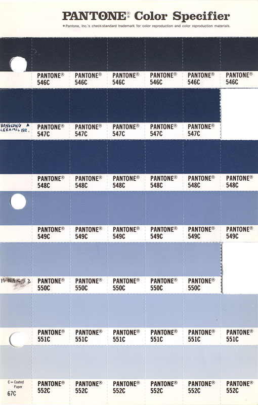
For 2016 they chose two colours for the first time: Serenity, a blue the tone of faded denim, sort of like 550C…
 …and Rose Quartz, like the cloudier version of rose quartz in this necklace.
 At first I dismissed them as ‘baby’ colours but they showed up in a lot of spring clothing which actually looked pretty good on me. So now I think of them as sophisticated baby colours.
I’ve always been fascinated by colour and I could go on and on but I think I’ll stop here. There’s tons more information out there about Pantone – Wikipedia is the most succinct.
More of Jennifer Nichole-Wells One Word Photo Challenge: Color

These are fantastic. I’d love to find one of these in a thrift store or something just to have. No way I’m paying for a new one anytime soon. Thanks so much for sharing!
I found a bunch more colour ‘fans’ after I wrote this including a metallic colour one – the metallic colours look way more lux in real life than they do on the computer screen – I almost swooned when I saw them. I was planning to donate them to the local art school unless you’ve got plans to come out to Vancouver any time soon!
Sadly no. But that’s awesome that you found all those. I’m sure the art school would absolutely love to have them.
Too bad – I’d love them to go to someone who loves colour as much as you do!
I really appreciate it. I do with I could make it up that way one of these days. But I’m sure that day is worlds away.